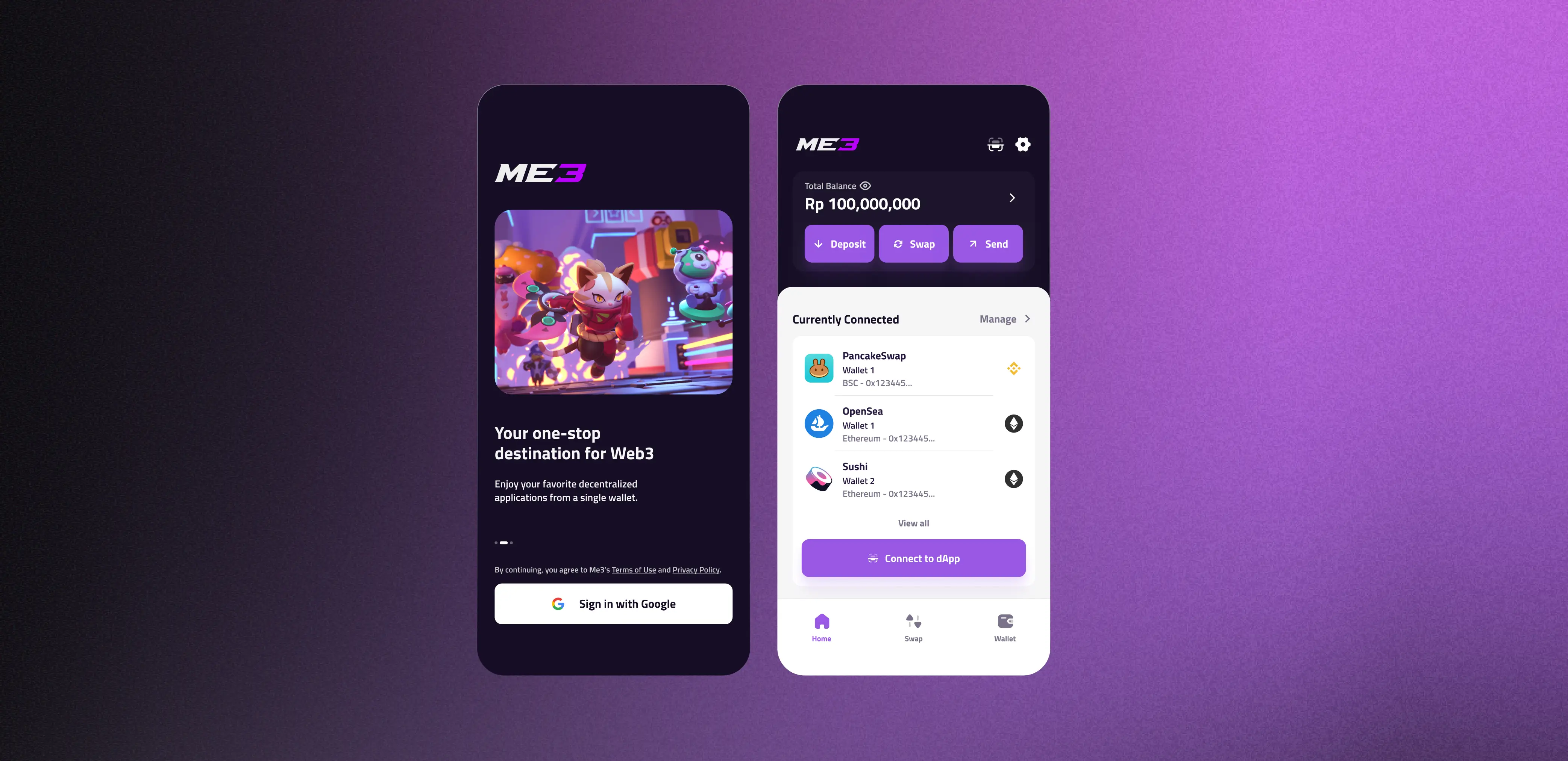
Wallet UX for Mainstream Adoption
GameFi was transforming gaming across Southeast Asia — but the complexity of Web3 kept most users locked out.
Despite the growing popularity of Play-to-Earn crypto gaming, the user journey was fragmented and overly complex. In mid-2022, I joined Me3 as a UIUX designer tasked with solving problem statements identified through their user research. The team had already reached the ideation phase, and I was brought on to help bring their ideas to life.
A fragmented journey with too many barriers
The goal was to remove the complexities of Web3 for Web2 users. Through market research, we found that the user journey was fragmented and overly complex — creating significant friction and frustration.
We identified three pre-requisites for users to start playing Web3 games: a non-custodial wallet with dApp support, funding with tokens, and purchasing NFTs. The most common starting point for Indonesian users was MetaMask, but on-ramping — purchasing crypto with fiat — required creating an account on a centralised platform and completing KYC requirements. Many users resorted to requesting tokens from peers instead.
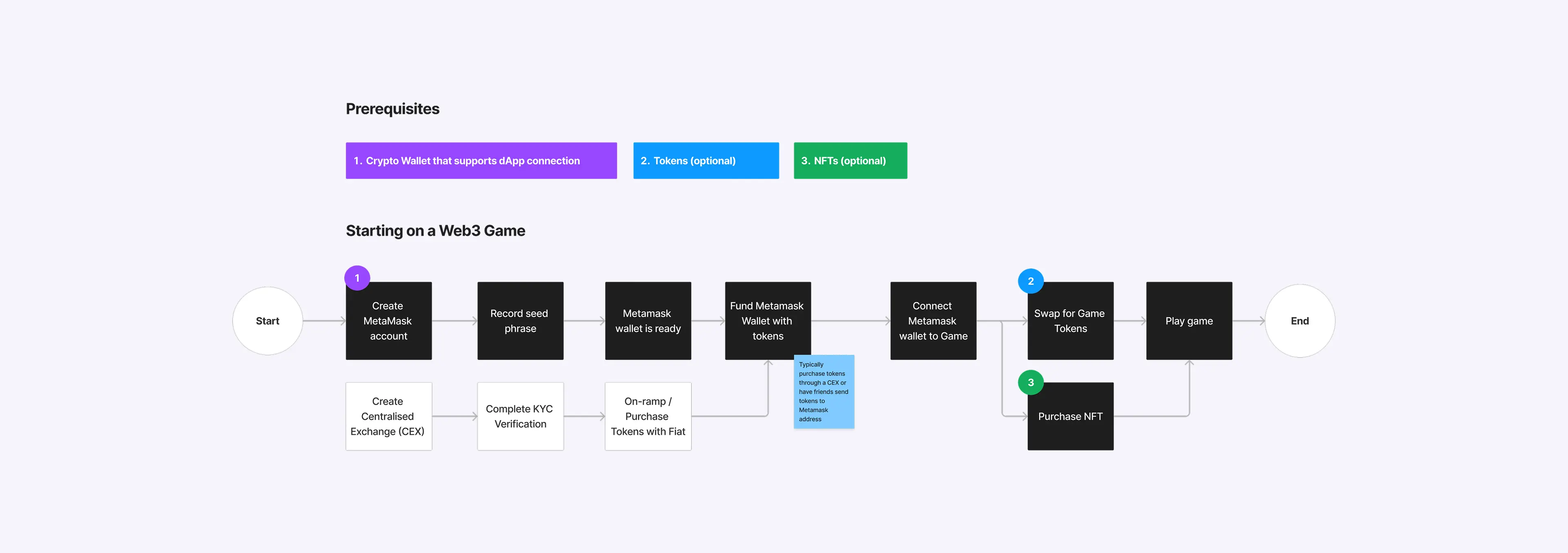
Fragmented user journey across multiple platforms
Turning complexity into clear problem statements
Having mapped the user journey, we identified key needs and opportunities for innovation, and developed problem statements to guide our design process.
"How might we simplify the onboarding process and make it more seamless for users?"
"How might we reduce fragmentation in the Web3 space and improve user experience?"
"How might we make everything simpler and more accessible for users?"
One app to replace three fragmented tools
During the ideation phase, I collaborated with the team to develop user flows, wireframes, and low-fidelity designs. Three key concepts emerged:
- A mobile application with a game-centred dashboard — allowing users to fulfil all three needs in a single platform
- Wallet creation via Google SSO — eliminating the need for seed phrases entirely
- In-app tutorials for each game to help new users get started without independent research
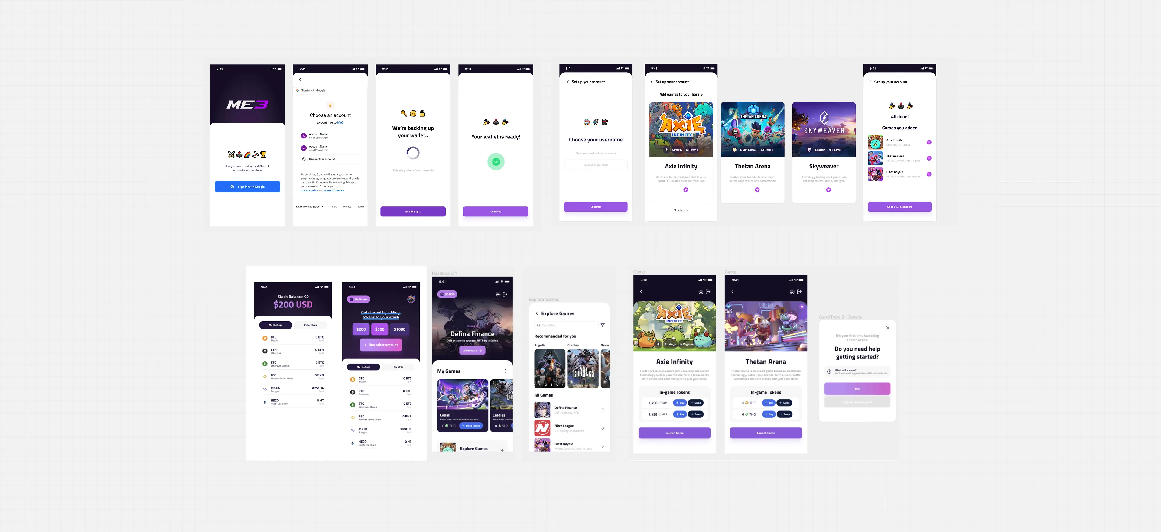
High-fidelity prototypes
Validating with users, iterating on feedback
During usability testing, we asked users to perform specific tasks — creating a wallet, funding it with tokens, and attempting game tutorials. Overall feedback was positive: users found the app easy to navigate and the wallet creation process simplified. However, we also identified areas for improvement, including clearer onboarding instructions and a more intuitive user flow.
We made iterative changes and continued testing until the design addressed most user pain points.
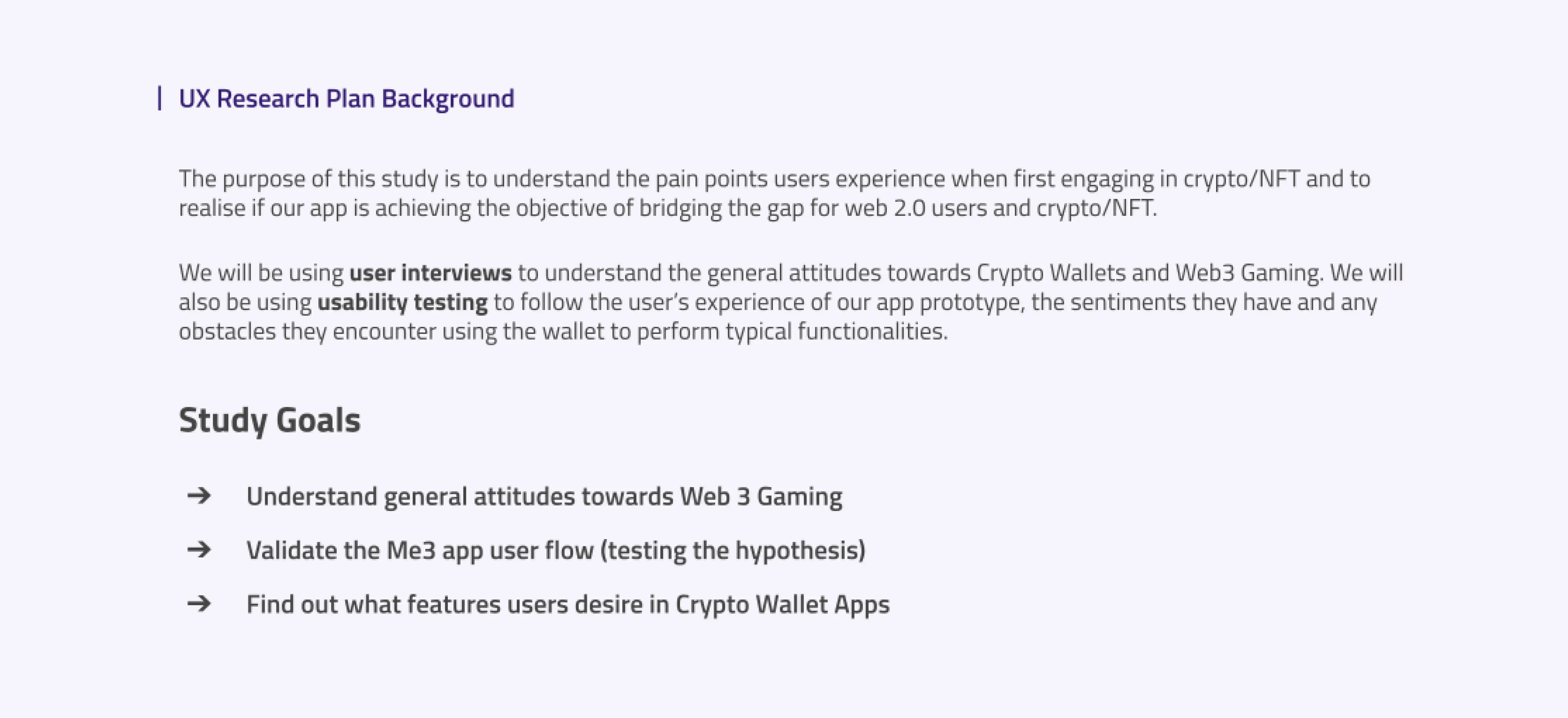
UX Research Plan
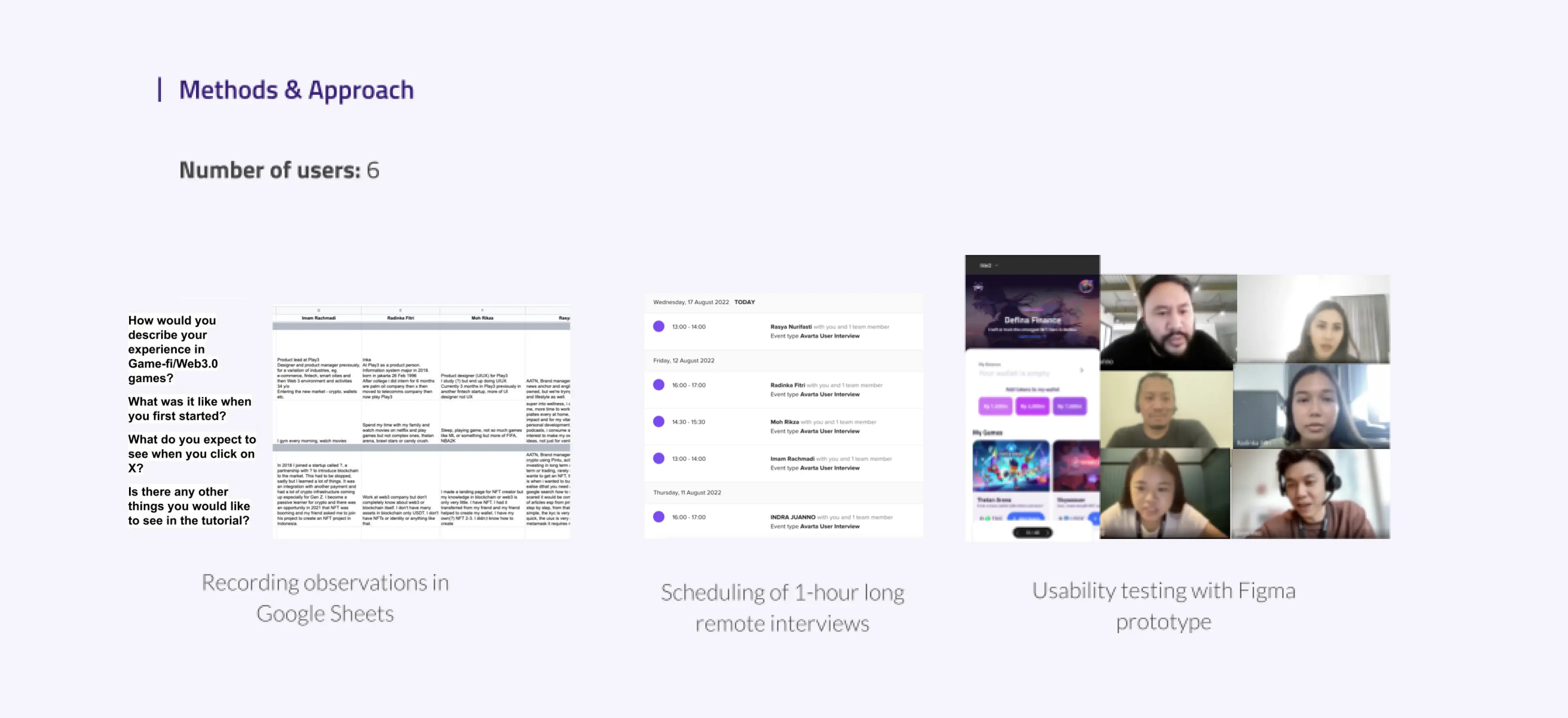
Research Approach
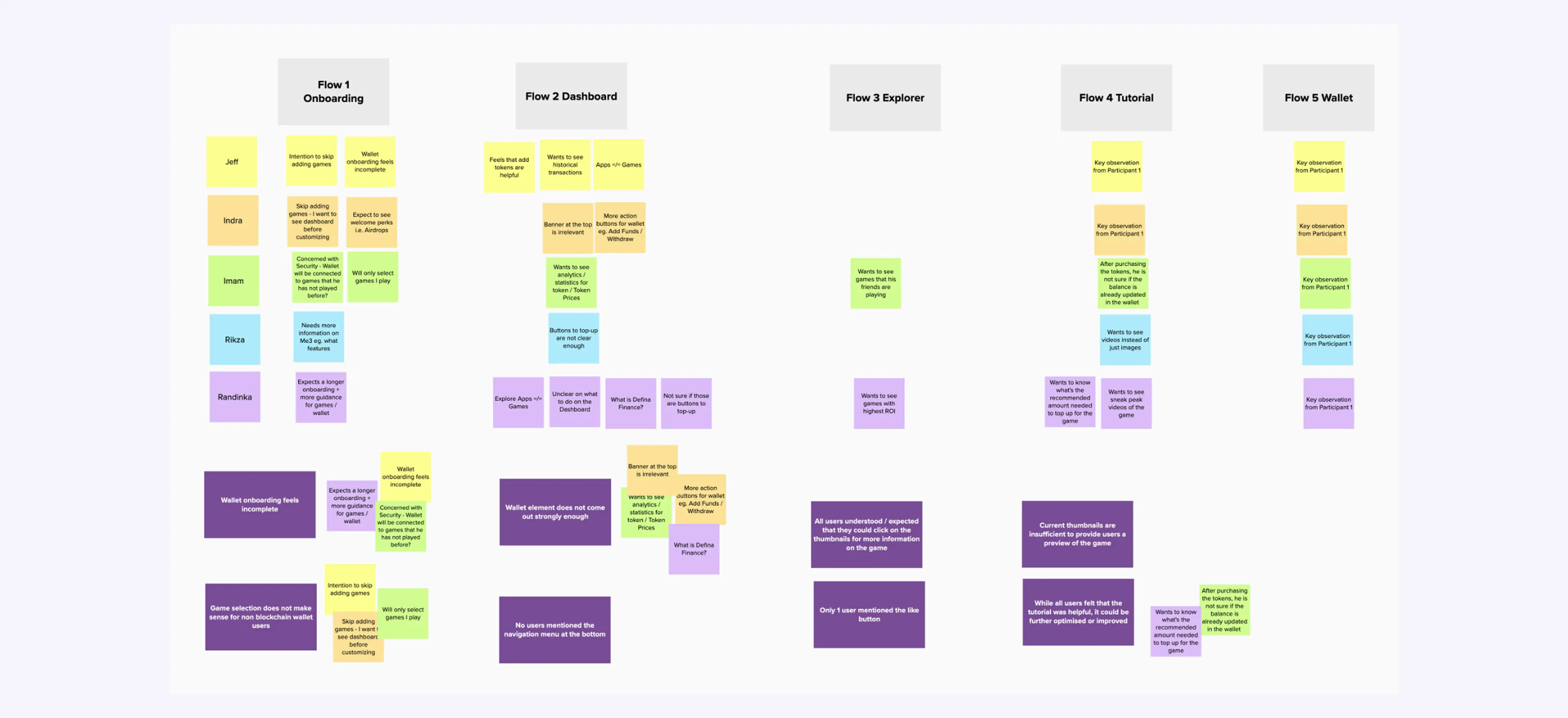
Synthesising Interviews
Users expected their wallet first, not the games
A key insight from user interviews was that users expected to see their wallet balance first, not a game-centred dashboard. This led us to restructure the onboarding flow — removing game selection at the start and surfacing wallet balances and a deposit button on the home screen.
We also found that users wanted more flexibility in the tutorial portion of each game, so we removed the progression bar and split the tutorial screens into shorter, optional steps.
Fuss-free onboarding
We eliminated seed phrases entirely, replacing wallet creation with a single Google SSO login. A short educational piece explains how to secure wallet keys — without overwhelming new users upfront.
Users can choose to deposit or purchase crypto later in the app, removing all friction from the initial experience.
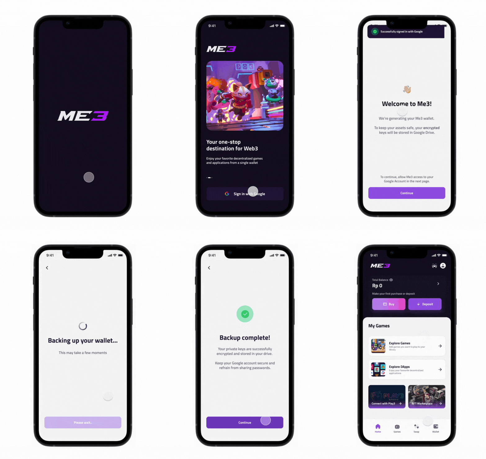
Onboarding — Google SSO wallet creation
Web3 games, all in one place
From the home screen, users can check their wallet and favourite games, and discover new ones through the Games tab. When ready to play, users can purchase or swap for the relevant game tokens without switching to another platform.
We also designed for direct fiat-to-game-token purchases, removing the need for multiple swaps across platforms.
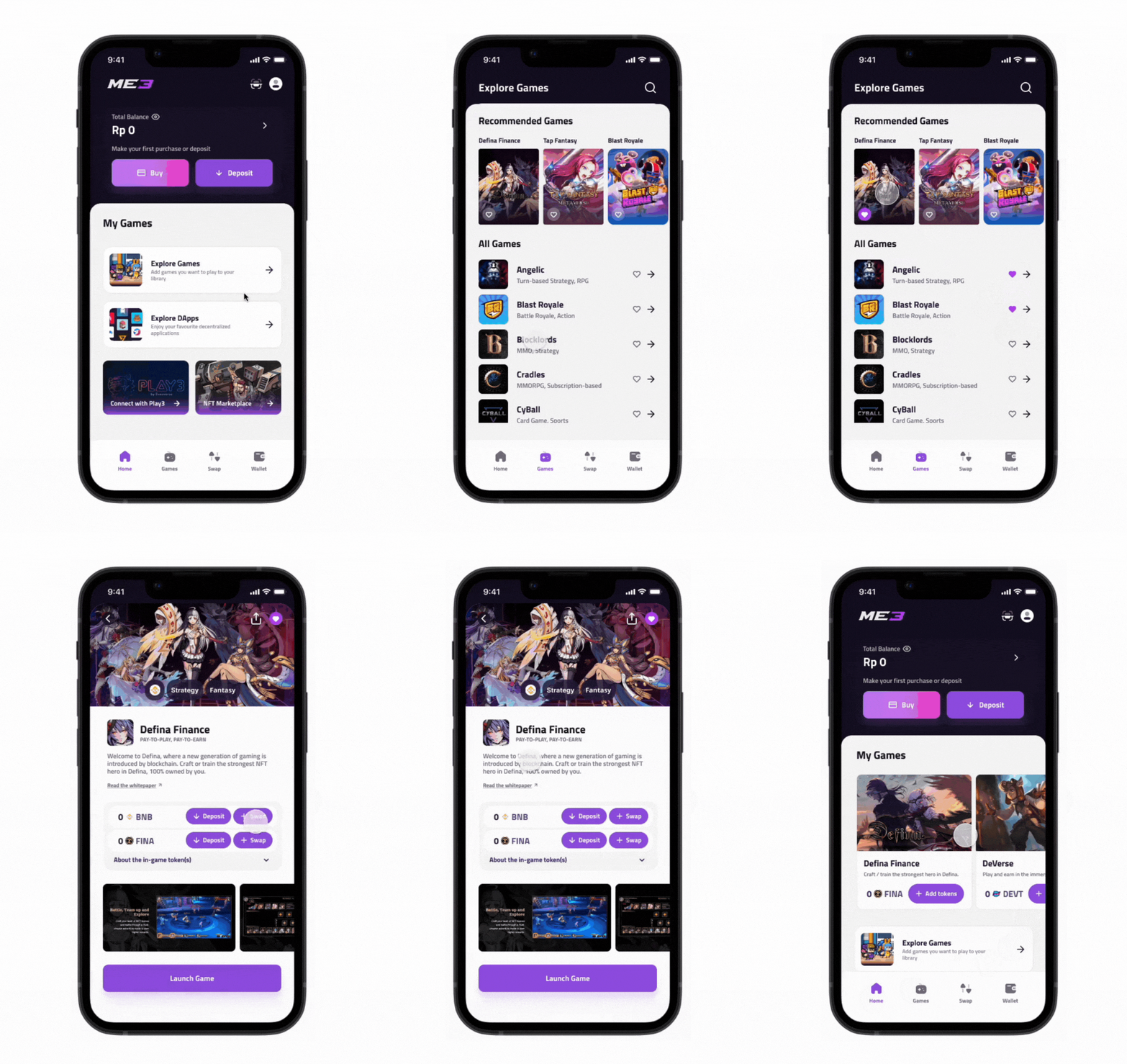
Home screen — wallet balance and game discovery
Multi-chain wallet management
Users playing multiple Web3 games across different chains often struggle with holding separate wallets for each. We designed a multi-chain wallet that lets users manage multiple chains — and multiple wallets — within a single app.
Users can easily control which chains are visible within each wallet, keeping their portfolio organised as they expand into new games.
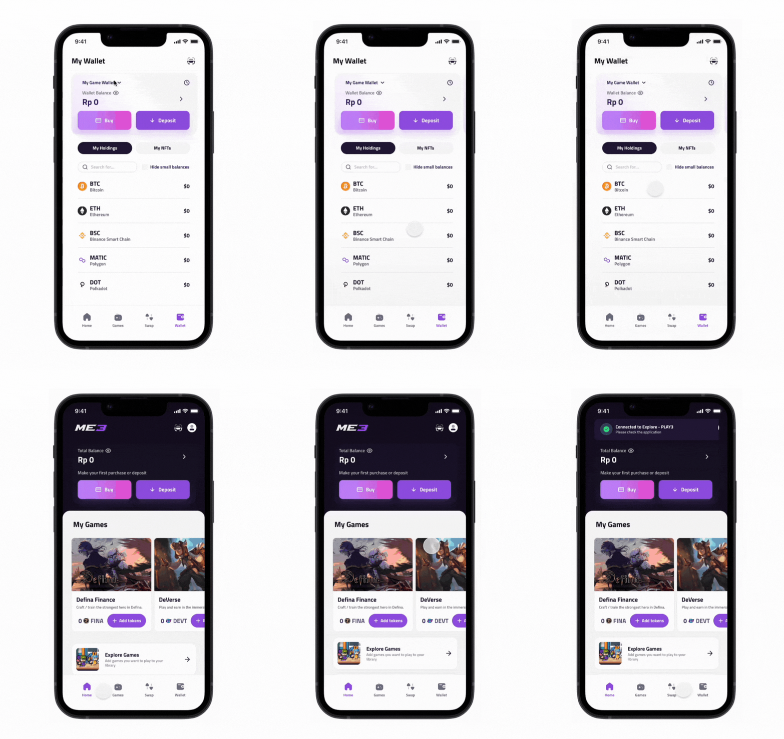
Multi-chain wallet — chain and balance management
Designing for a space still defining itself
Designing in the crypto space posed unique challenges — the inherent complexities and nuances of blockchain products meant there were few established UX patterns to lean on. The project presented a clear opportunity to improve UX in the Web3 ecosystem by translating familiar patterns from Web2 into a new context.
I appreciated the opportunity to conduct primary user research on a geographically distant market. Beyond validating design decisions, the research gave me a strong foundation for advocating on behalf of users throughout the process.
Throughout the project, I applied principles from Lean UX — writing hypotheses based on business assumptions and validating them through research. While there is always room for refinement, I was able to leverage existing wallet design patterns to create a usable, accessible experience.
After handing over designs for development, I was also involved in the product management process — a close collaboration with the development team that gave me transferable skills well beyond UI/UX design.