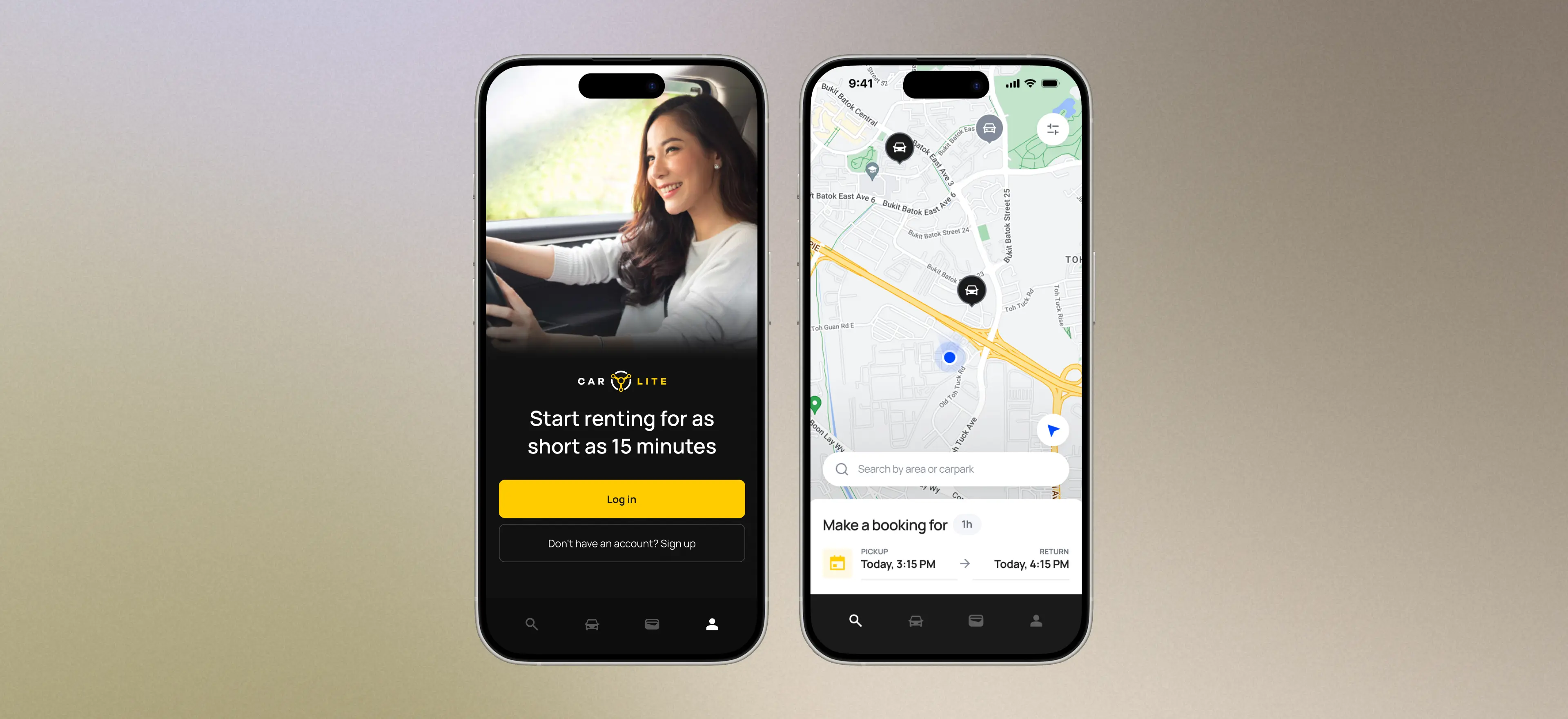
Designing a Mobile Car Rental Experience Users Trust
In Singapore's car-sharing market, competitors had already shaped user expectations with mobile apps that prioritised speed, convenience, and usability.
Car Lite differentiated itself through competitive pricing and strong customer support, but its outdated website lacking mobile optimisation was becoming a limitation.
I was brought in to design and launch a mobile app to help the business remain competitive.
To understand user behaviour, user expectations, and identify opportunities for improving Car Lite's mobile rental experience, a research plan was devised.
| Research Goal | Method | Purpose |
|---|---|---|
| Understand what car-sharing users truly value | User interviews with existing car-sharing users (Car Lite customers and non-customers) | Explore motivations, concerns, and behaviours related to overall rental experience |
| Identify pain points and friction across existing rental journey | Journey mapping using customer support insights and user feedback | Map the rental flow to identify high-friction, high-stress moments and uncover opportunities for UX improvements |
| Understand how competitors shape user expectations | Competitor analysis, user interviews, competitive testing and secondary research | Understand expectations surrounding car-sharing, benchmark onboarding flows, booking experiences, and other features |
| Validate proposed improvements | Usability testing on prototypes | Evaluate whether users can efficiently complete key tasks eg. vehicle search, booking, and trip start/end flows |
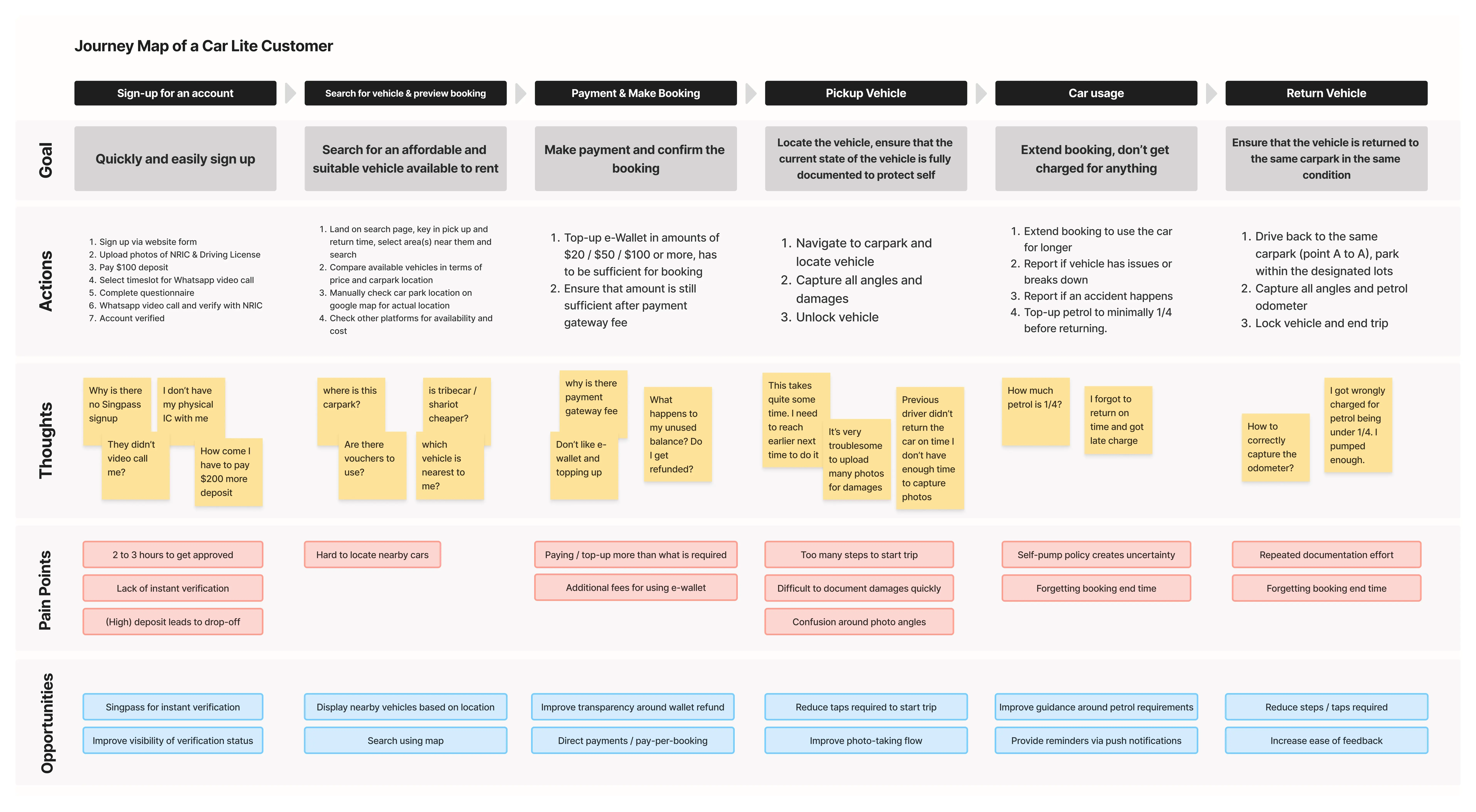
Car-sharing users optimise for self-protection
- Over-documenting vehicle condition
- Reaching early before trips to inspect vehicles
- Checking with the community (eg. Telegram groups) about the state of the vehicle before booking it
Start and end trip flows are high-stress moments
- Excessive taps and steps required
- Time-sensitive task
- Conflict of wanting to complete it quickly yet document it thoroughly to protect themself
Onboarding friction is shaped by user expectations
- Competitors already provide fast and low friction onboarding including Singpass sign-up, instant verification and no deposit payment
- Car Lite's required multiple manual steps, deposit payment and delay before verification
Upon reviewing the research findings with stakeholders, the primary goal set for the app release was to retain existing users, followed by reduce account sharing and fraudulent behaviour, then user acquisition.
Thus we defined success for V1 as:
- Driving adoption among existing users
- Delivering a stable and reliable mobile experience
- Reducing friction in high-frequency, high-risk flows
I focused on improving the core rental journey to reduce frustration and pain points, and intentionally deferred higher effort initiatives such as Singpass integration, direct payments and vouchers to future iterations.
Search for available vehicles using map
Vehicle discovery lacked spatial context.
Search results were presented as static lists with text-based addresses, requiring users to mentally interpret proximity or rely on external tools like Google Maps.
To address this, I redesigned the flow into a map-first, location-aware experience anchored to the user's real-time location, where vehicle availability is displayed directly through map pins based on the selected date and time.
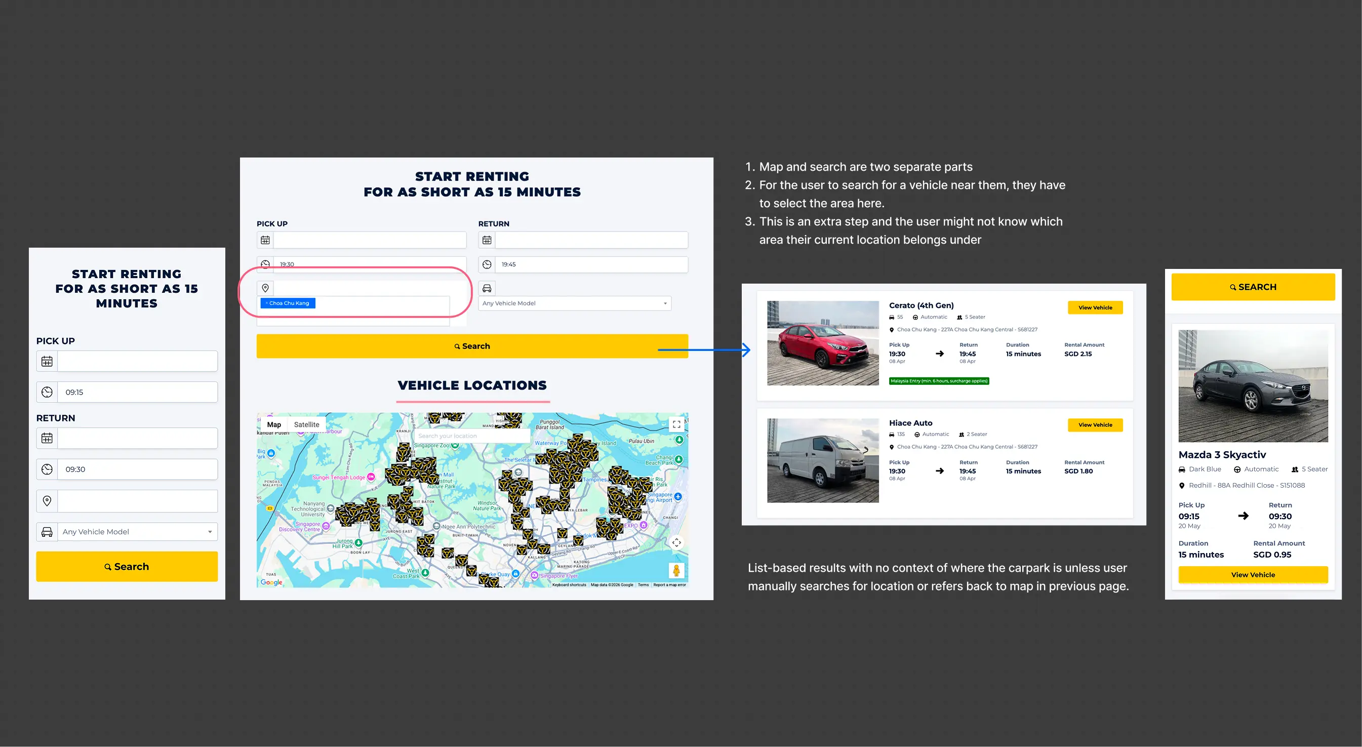
Vehicle Search on Web (Before)
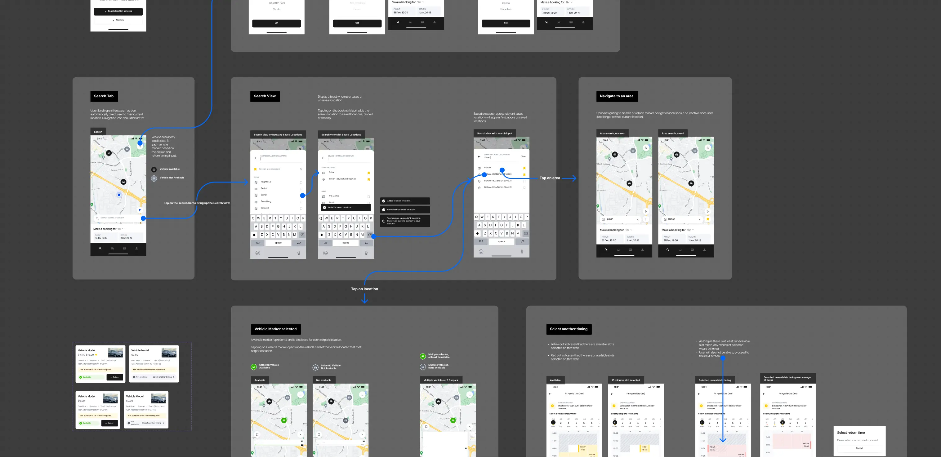
Prototyping
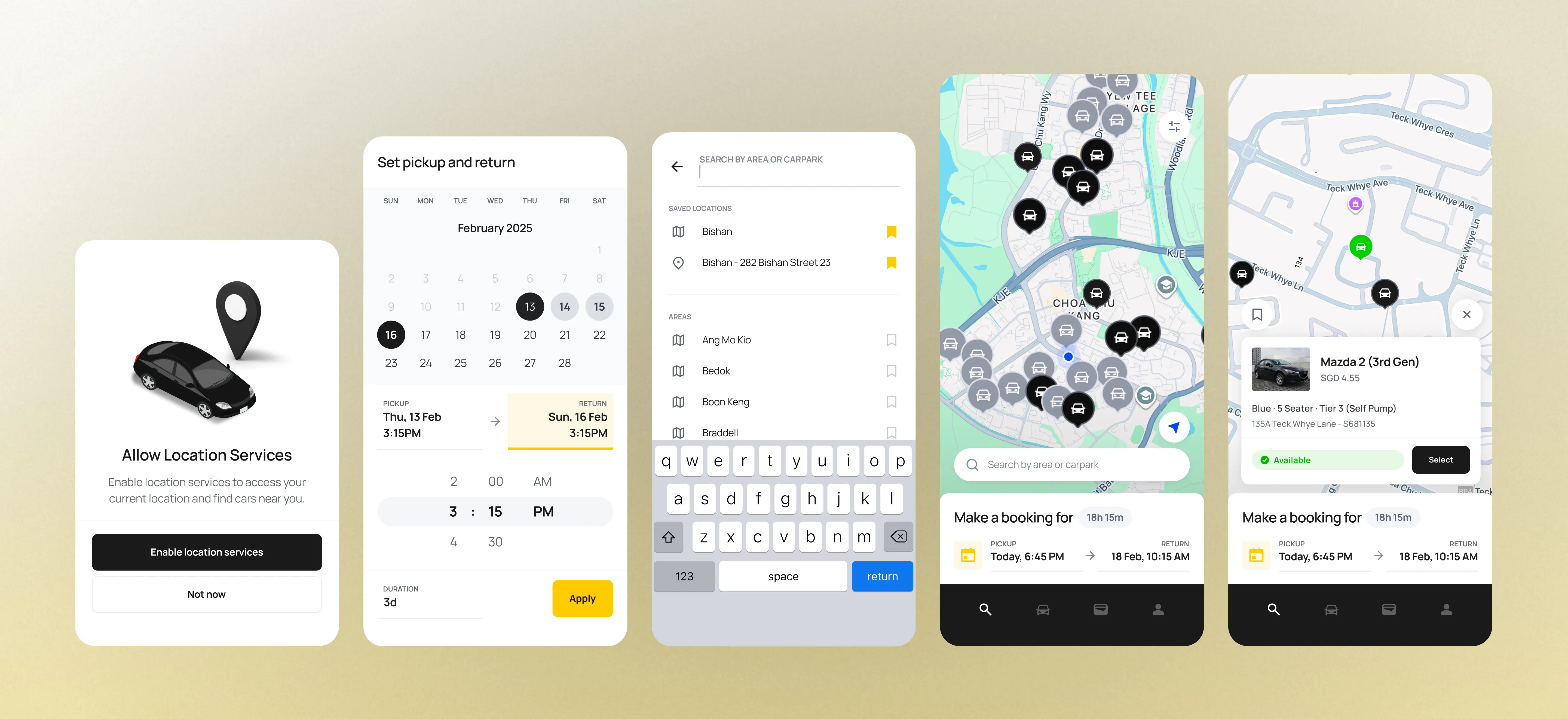
Vehicle search on App (After)
Streamlined start and end trip flow
Trip start and end flows were inefficient and error-prone.
For a user capturing an average of 4 angles and 3 photos of external damages,
- Before, on the website: At least 17 taps required before the car can be unlocked.
- After, on the app: Only 9 taps through guided, sequential photo capture using a custom in-app camera, and a car diagram to help users correctly identify required angles.
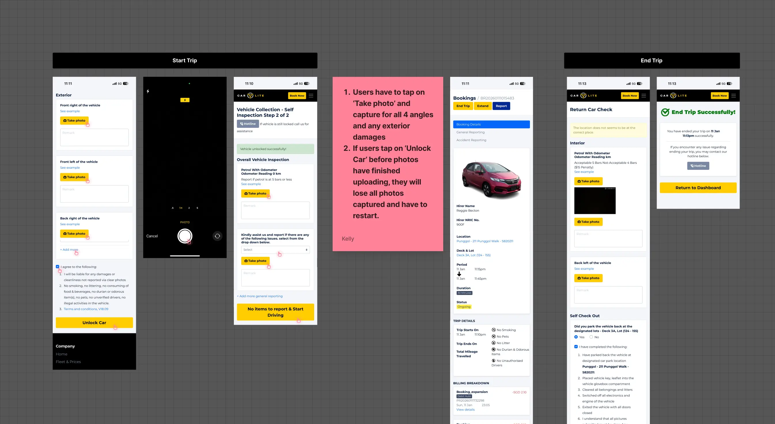
Start Trip for Website (Before)
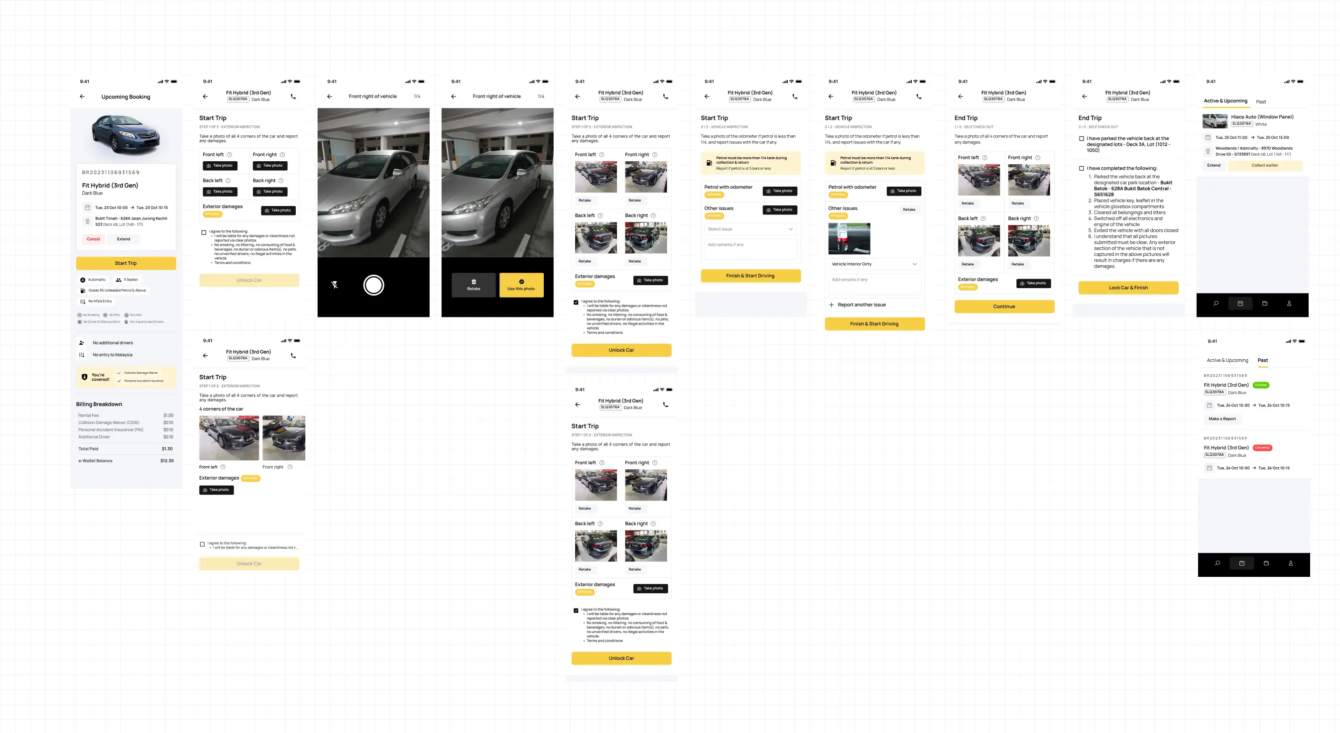
Drafts
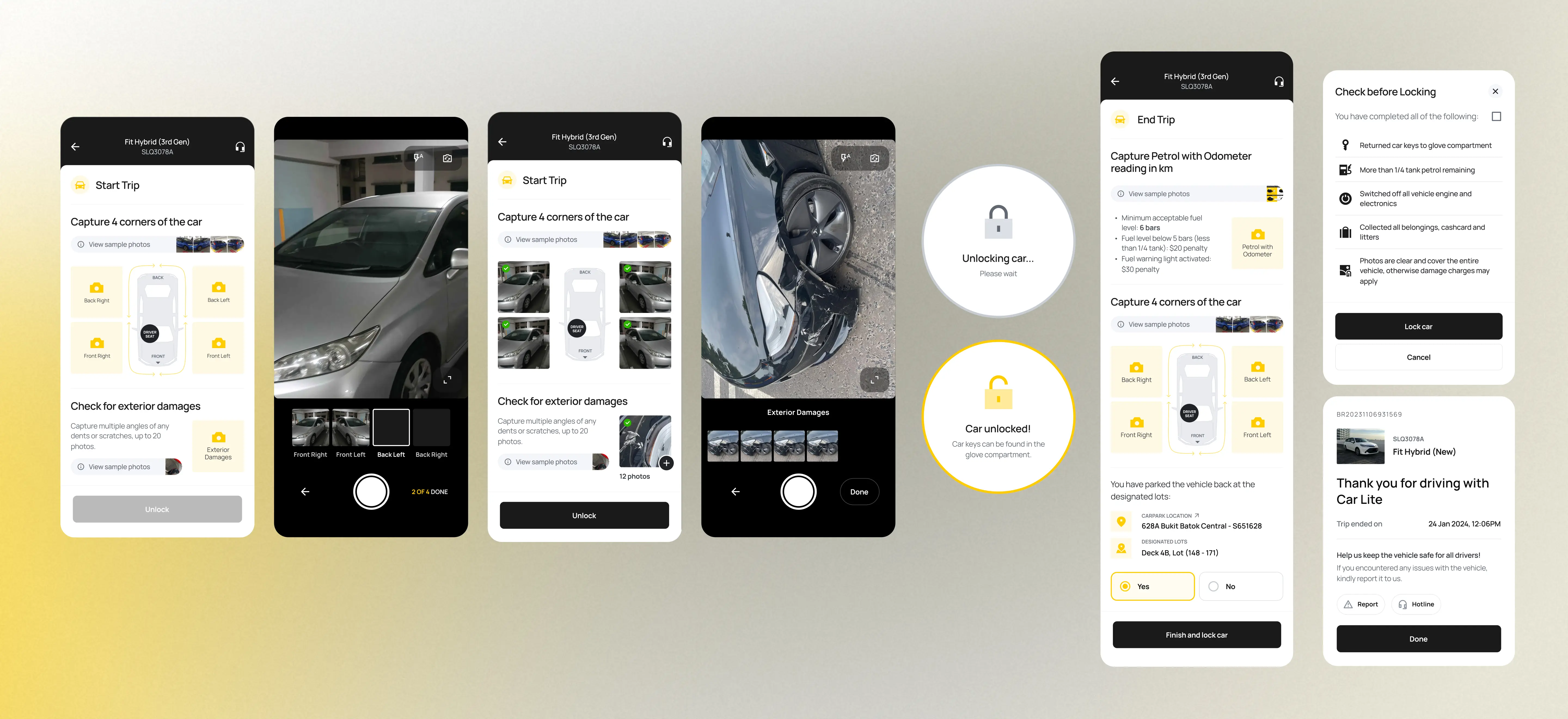
Refined Start and End Trip screens
Users could pre-capture photos with their phone camera and upload photos from their camera roll when it's time to start trip. This was problematic for the operations team as users could edit photos and culprits can get away with damaging the car.
To balance business and user needs, camera roll uploads were disallowed and users had to capture photos directly using the in-app camera only, but automatic save to camera roll was introduced so that users could still choose to keep their own copy of the photos. Start and end trip photos were also displayed in the booking details viewable after trip fulfilment.
State-Driven UI & Visual Hierarchy
The previous interface was dense and text-heavy, making it difficult to locate relevant information.
I restructured the experience to be state-driven:
- Tabs for ongoing, upcoming, and past bookings
- Elevated key actions through hierarchy
- Reduced reliance on text through clearer layout and grouping
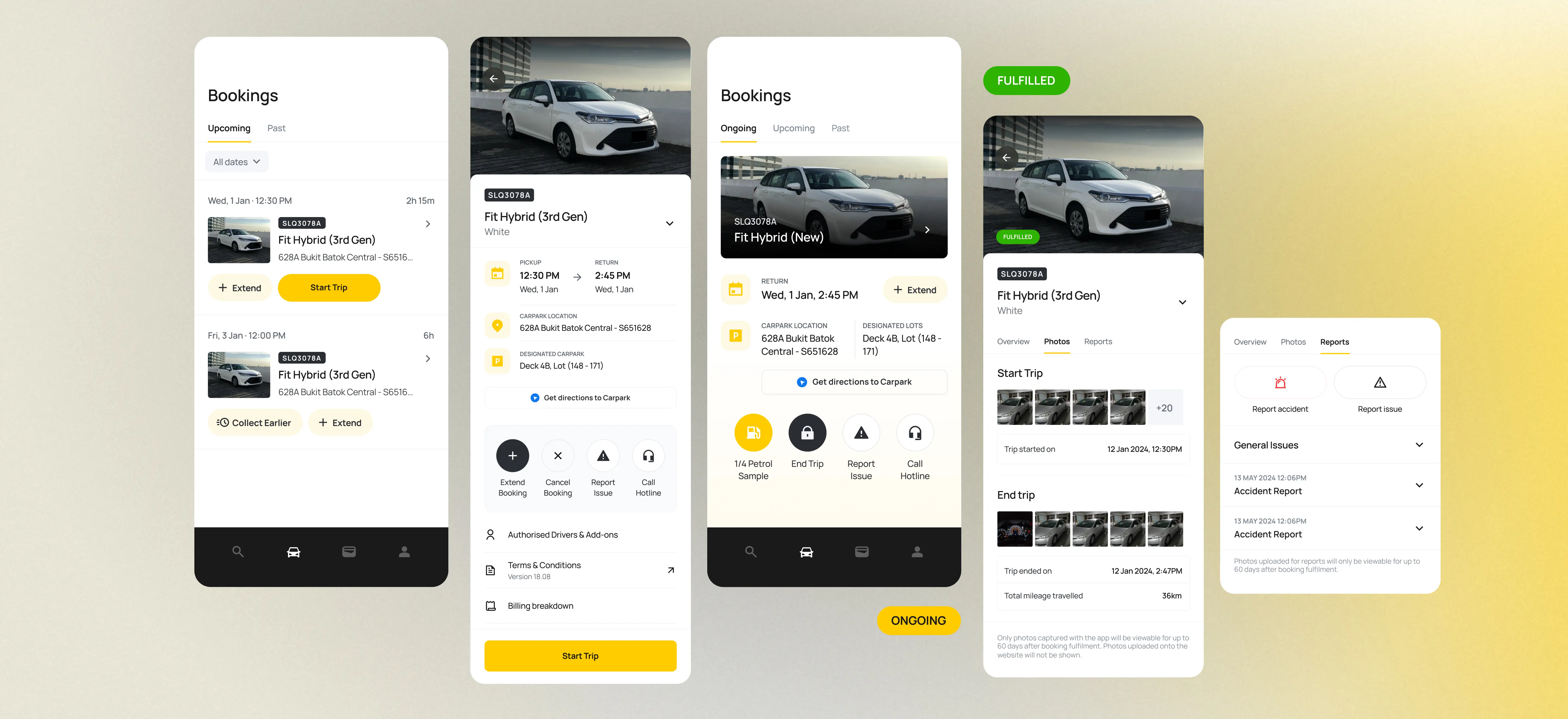
App UI (After)
After rounds of internal testing and beta testing, the app successfully launched in May 2024.
Within 3 months, the app had an 86% adoption rate, with most users transitioning from app to web while the website remained as a secondary fallback channel. The app also established a strong foundation for future features that I worked on with my team, such as signing up with Singpass.
Error rates reduced
In critical flows such as booking start end trip
Improved trust
Through increased transparency and clear documentation
Positive user feedback
Highlighting speed, reliability and usability
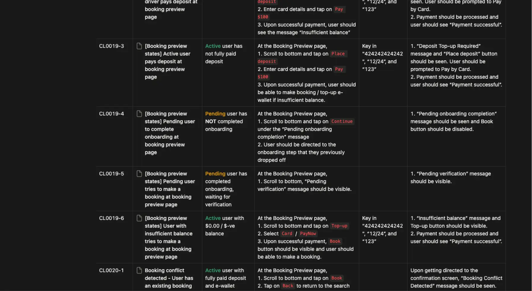
QA test cases
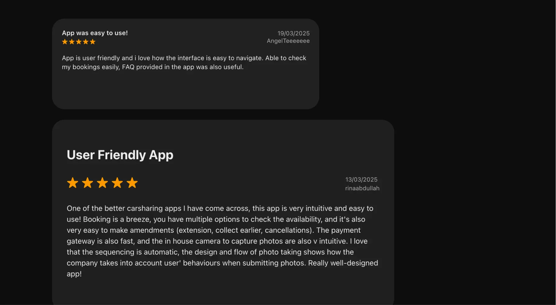
Positive app reviews
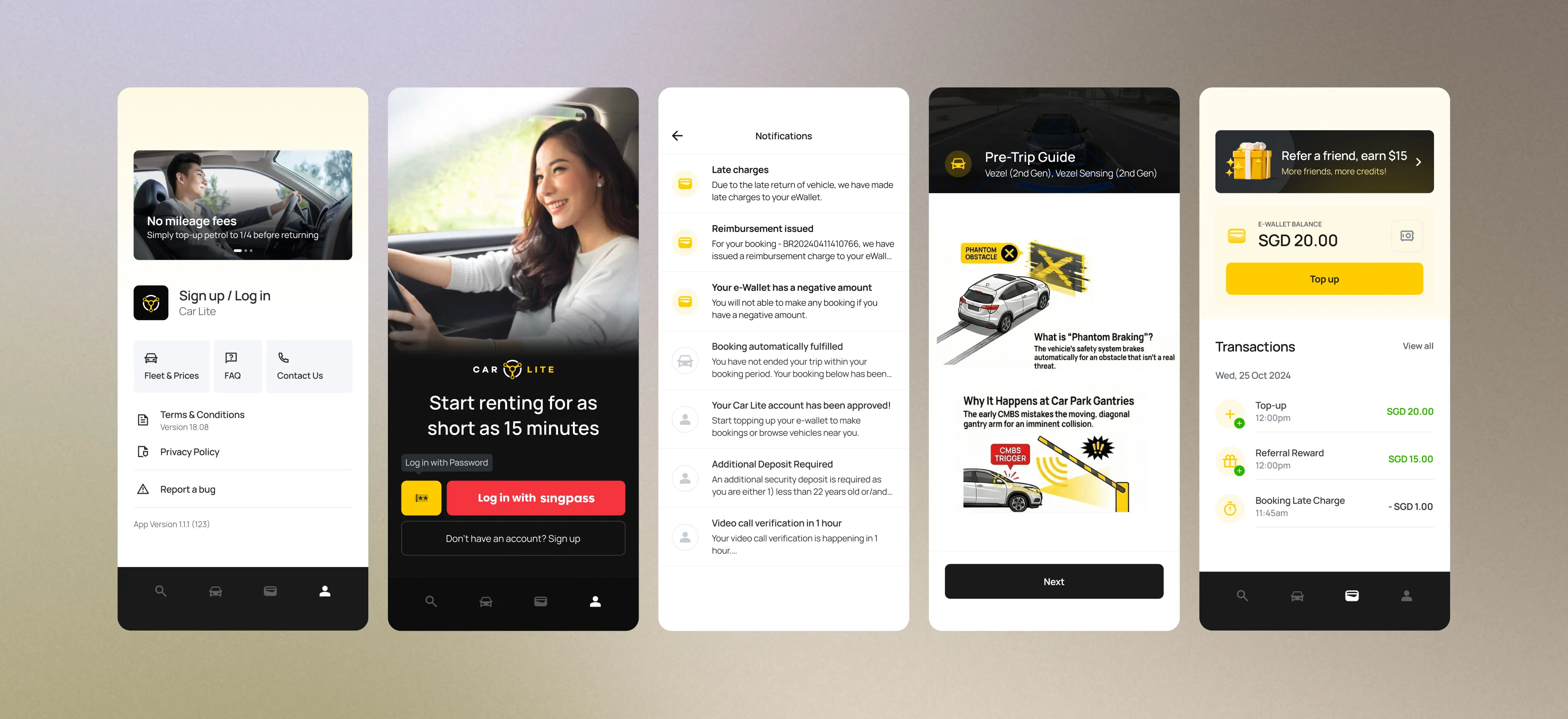
Other completed features